
Building and Scaling a Design System
The application Index Exchange is built on hasn’t scaled to suit the needs of the business resulting in inconsistency, production inefficiencies, and a poor user experience. As part of the initiative to design and build a new modern, responsive, and intuitive application I lead the creation of a design system to act as a foundation for the future of Index Exchange.
This is still an on-going project involving many stakeholders outside of the product design team. Below I will take you through the current state of the system and the strategy I developed to execute on the system. There have been many challenges along the way but it's been worth the effort.

My Role
Over a year, I lead the design, development, implementation, and on-going support of a design system in collaboration with three other product designers, and three teams of engineers.
I focused on 5 things in my capacity as design lead on this project:
- I lead collaboration with Senior Engineering stakeholders to conduct a study of existing front end architectures.
- I got buy-in to invest in a design system with senior leadership, proving it was a valuable use of time, and building out the team to do it.
- I rallied my design team to collaborate on designing and building the design system.
- I ensured there was a good strategy in place to execute on a high-quality product that got done.
- I evangelized the system across the organization creating a guild and extensive documentation to ensure the system would continue to scale and get used by all teams.
This project was an innovation challenge that I solved with internal processes, tools, strong leadership, and collaboration throughout the organization.
The Problem
At the beginning of 2018, the CEO of Index Exchange said thast designing and bulding a new application that reflects the maturity of Index Exchange was a company priority.
We had a lot of problems:
- UI patterns weren’t scaling
- Engineers were doing god knows what with our implementation
- Designers were reinventing patterns
- Executives were sad that product took long to build
- Quality of product felt shoddy
So how the heck did I get a new fandangled design system + front end framework to stick across an organzation of 200 engineers with only a team of 4 designers?
The Insight
Before we could define a product vision for this new experience we had to align stakeholders on what was and wasn’t working for the Index Exchange application and product development process. Luckily, I had previously completed an extensive heuristic evaluation and UI audit of the Index Exchange application that culminated in the creation of standardized design patterns documented across a web-based pattern library and supporting UI kit. As a result, I had a readily available synthesis of the major UI patterns, pain points, and UX issues plaguing the Index Exchange application. Because of this, the associated issues with the product development process were well understood. I consulted with our stakeholders to gain further feedback and validation to create a holistic picture of the pain points with the Index Exchange application and developing products on it.
Once equipped with these insights I was able to build consensus among stakeholders on the following themes:
Consistency
- Interaction design guidelines and patterns for the consistent use and implementation of UI elements across the application did not exist.
- Standards for front-end code implementation did not exist.
- UI elements have multiple interpretations existing in the codebase.
Efficiency
- Design solutions have repeatedly reinvented the wheel when pre-existing solutions were available.
- Code duplication is rampant across the application.
- Available component libraries are not being leveraged by engineering.
- Slow load times due to application bloat
Accessibility
- The majority of the application and its UI elements fail WCAG 2.0 standards.
- WCAG Standards are not currently a consideration in the product development process.
- No or limited support for other accessibility focused interaction patterns (alt text, tabbing, etc.)
The Vision
In the process of aligning stakeholders around the themes of consistency, efficiency, and accessibility an emergent theme of product quality came clearly into view. We set out to define a vision inclusive of these themes that we could generate design solutions for while collaborating with engineering to define and implement the technological solutions. It became clear that a systems-level solution would be required to solve this problem. We decided we would create a Design System to ensure quality, consistency, and efficiency to reduce costs and increase user satisfaction.
The Frameworks
While we worked tirelessly to identify design opportunities, build consensus, and define a vision our engineering organization had already decided to pursue the question of front-end frameworks independent of product design. A comparative study was conducted between VuJS, AngularJS, and ReactJS. It was decided that AngularJs would be the front-end framework used to develop the new Index Exchange application. Once I became aware of this decision I quickly worked to ensure senior engineering stakeholders would agree to collaborate with the product design team on future decisions that would impact our future design system.
There were two problems we were asked to provide design input on. First, what layout model would we want to use in our new application? CSS Grid or Flex? Second, knowing that AngularJS was their chosen framework what component library would we want to use? Engineering recommended CSS grid for the layout model and BootstrapMD as the component library. We recommended Flex for the layout model and Angular Material as the CSS component library. After extensive debate amongst senior engineering stakeholders, our recommendations won out (thanks in part to a pitch we prepared) and engineering chose to proceed with Flex and Angular Material.

The Solution
For better or worse we were now locked into a layout model and a component library before we had even begun to design a single thing. It was clear our engineering organization wasn’t going to wait for the Design System to build this new application. Most people in the company didn’t even know what a design system was let alone how to execute one. So, I took it upon myself to conduct an extensive research initiative to learn everything I could about design systems, and how to develop one. I would become an expert on the subject so I could shepherd this design system to success.
After researching design systems, I recommended the following strategy:
There was only one problem, steps four and five of the process had already been completed with minimal consideration of the holistic vision for the design system. Rather than follow the recommended linear strategy it was clear I would have to improvise if we were going to pull this off.
The Process
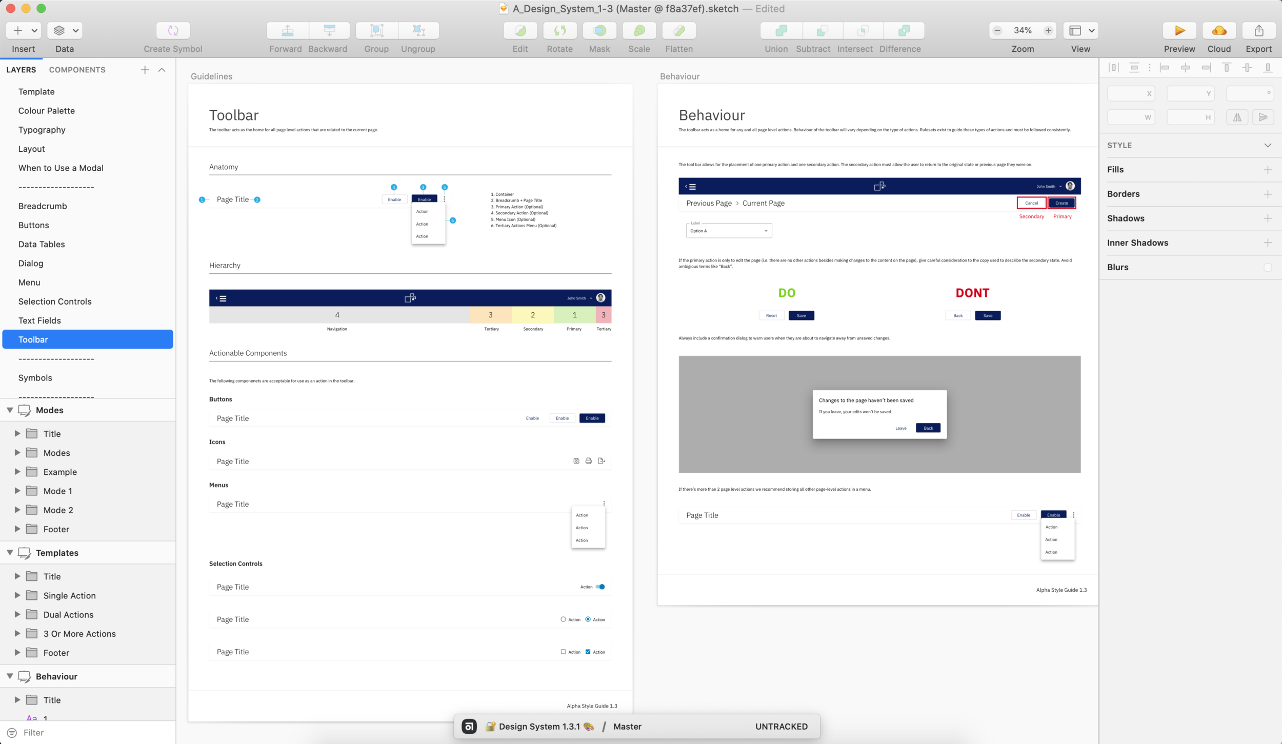
Team Models and Composition
We needed the right team model to implement the design system. I recommended the following model based on my research, so we would be staffed properly.


Alpha Style Guide
I worked closely with one other product designer on my team to begin the creation of an alpha style guide as a proof of concept for our emerging design system. This meant defining a shortlist of UI elements in a Google Doc we felt were necessary to support the majority of functionality in the Index Exchange application, designing the first iteration of these elements in Sketch, and testing them in a contextual setting.
Component Development Process
Development and implementation was outside the scope of resourcing provided at the time so, I modified a model for the systematic design, development, and implementation of components to execute exclusively on the design phase of the system. The model would produce complete interaction and visual designs serving as usable and documented elements in a shared UI library. As the manager of the design team, I would use my team to execute this design phase for all of the UI elements defined in the alpha style guide. During this period I acted as design lead for all components, while also executing the design process for 35% of the alpha style guide UI elements.

The Transition Strategy
Because we were designing and building our design system in a silo we made progress quickly. Because of this the communication strategy would be more delicate across the organization. We had to find and create occasions to introduce people to the system so we adopted a strategy of, 'show, don’t tell' when working with individual engineering stakeholders or teams. Because our system was also supporting the development of Index Exchange’s new application we worked with our product stakeholders to define a progressive rollout strategy known as legacy-bridge where we would continue to support both our old Bootstrap web application and our new Angular web application in parallel, allowing users to move seamlessly between them. In this progressive rollout strategy products and features from the old Bootstrap application would slowly be redesigned, rebuilt, and replaced in the new Angular application.


The Guild
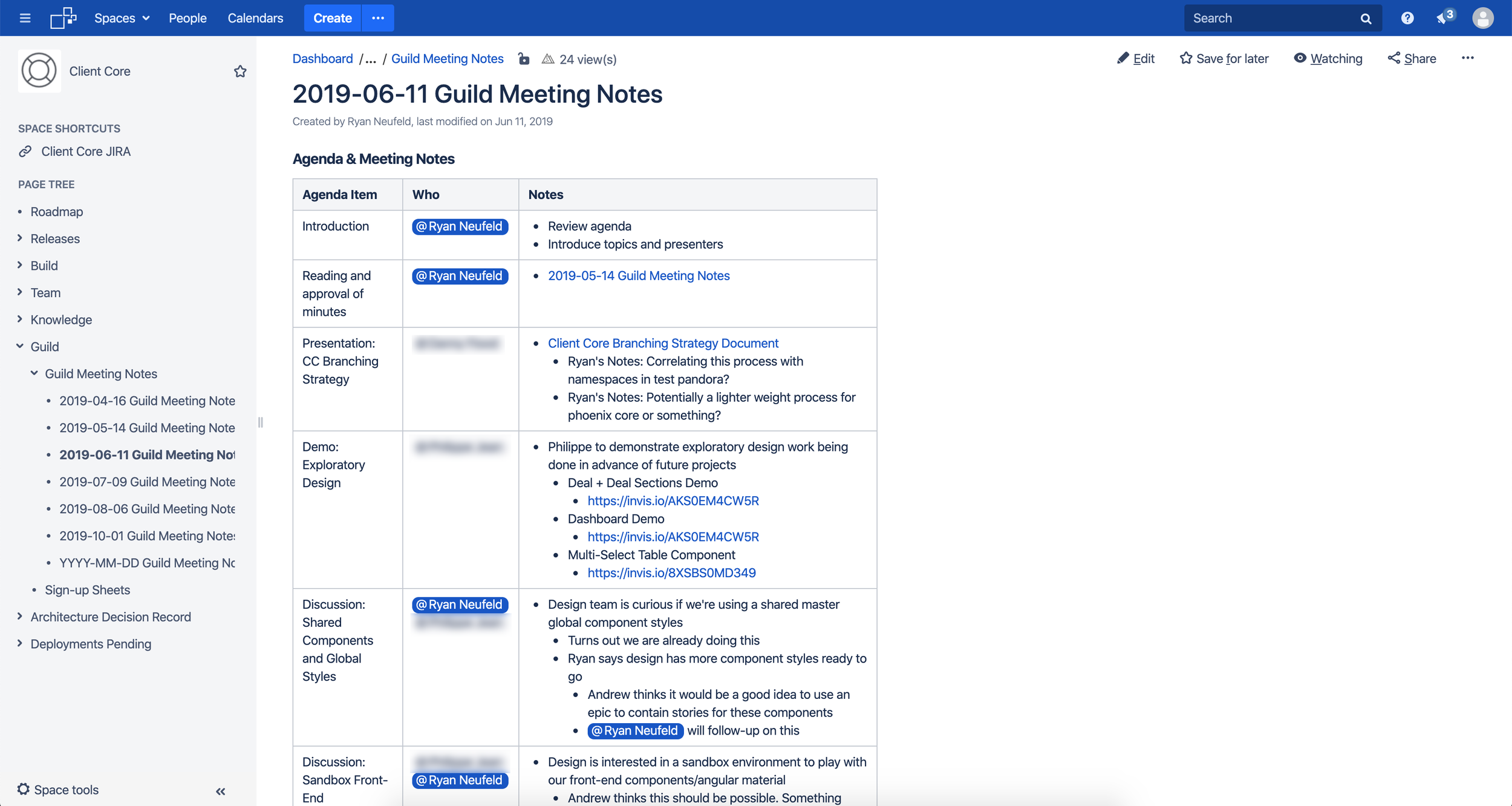
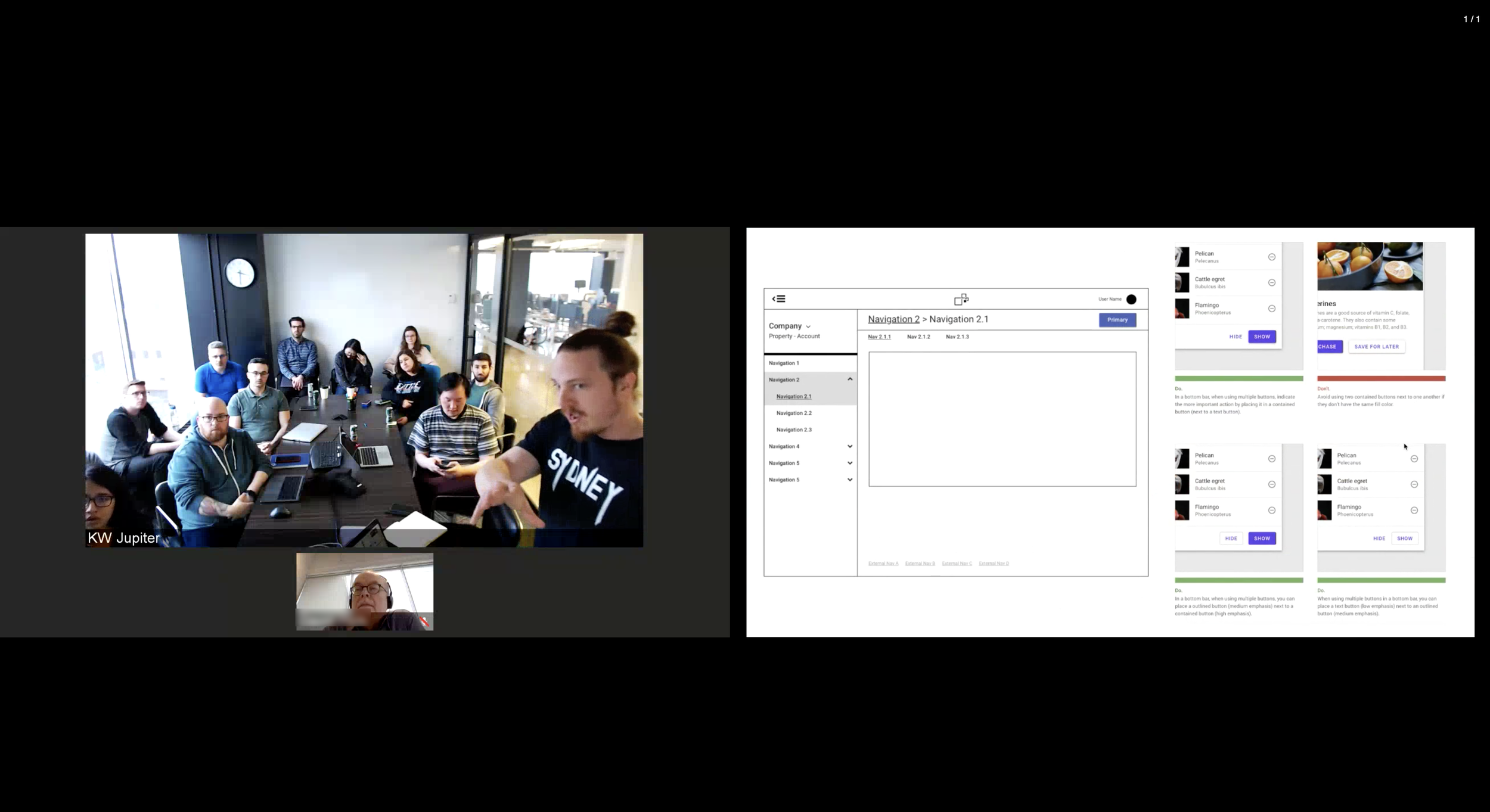
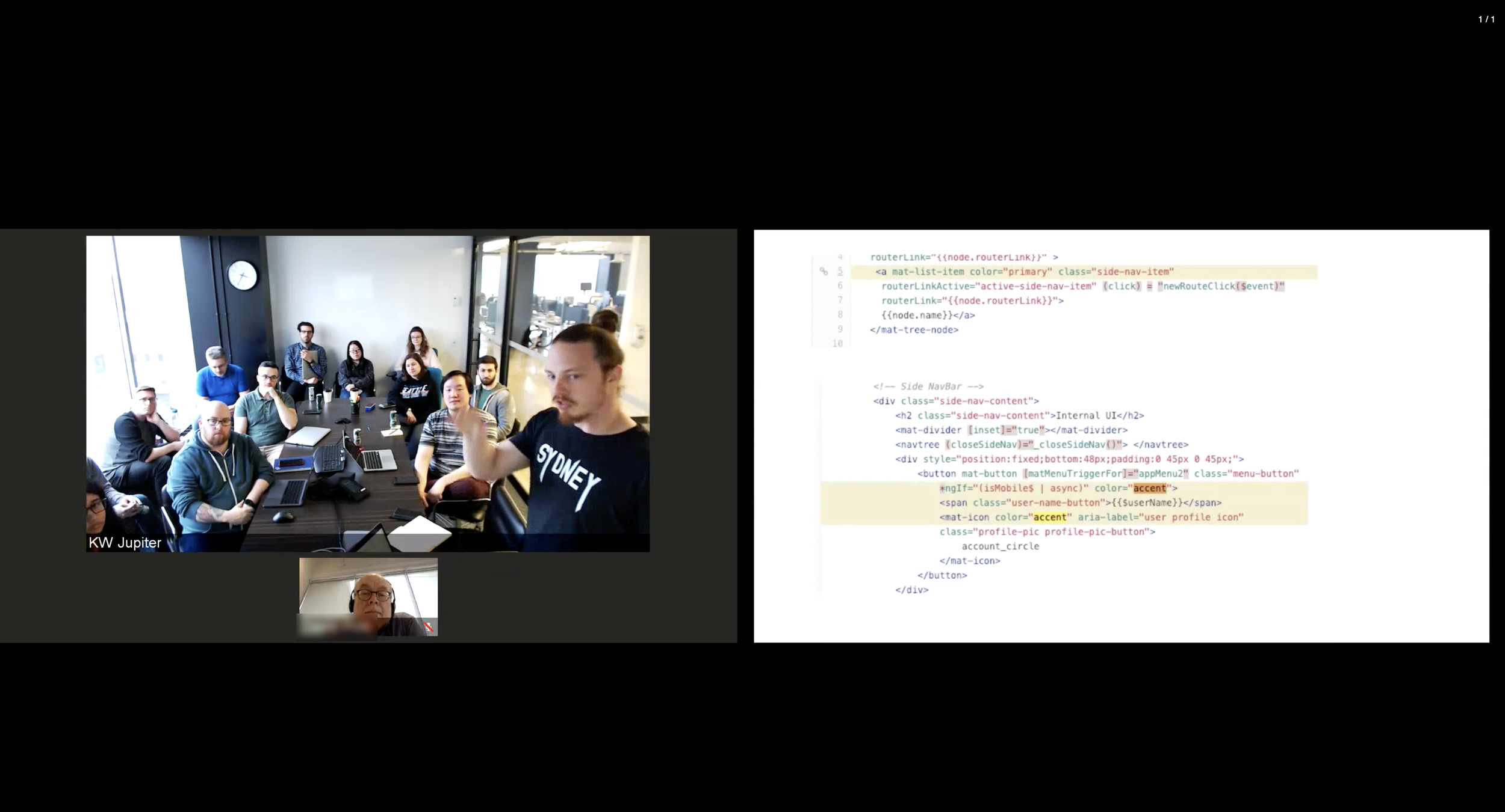
I started a ‘Guild' to ensure our design system received the love and attention it needed to succeed during its progressive rollout. The guild was a collection of designers and developers who met once a month, to discuss ways to maintain, improve, and evolve the design system. The Guild was run by myself, an Engineering Lead, and an Engineering Manager from the Client Core Product Delivery Unit (PDU). Outside of meetings, we used Confluence and Slack to manage the guild. We scheduled guild meetings in advance, using our Confluence space as a public space for meeting agendas, notes, and recordings. Guild members from across the company were invited to bring discussion topics to the meeting and we would regularly demo components or design patterns to gather feedback.
The Requirements
Although highly complex and multi-faceted three tangible outputs came to represent a functional design system for Index Exchange:
- A shared Sketch library used by the Product Design team to create high fidelity designs.
- Centralized documentation acting as a single source of truth for design and engineering.
- A master theme file containing the CSS customizations for Angular Material components.
The shared Sketch library and documentation were deliverables that I owned as the design lead and were primarily executed by my team and me. The development and implementation of the custom theme and components fell to our engineering division although we had designed and provided all of the specifications. Effective execution required extensive collaboration and creative thinking to come up with a process for development, and implementation that also involved stakeholders across their division. I solved this problem by forming a guild comprised of front-end development champions from across engineering teams tasked with servicing product channels that require a user interface. These three requirements are still ongoing.
Detailed Design
Foundation
Spacing
I conducted extensive research into spacing strategies and quickly adopted an 8-point grid system. The 8-point system uses multiples of 8 to define dimensions, padding, and margins of both block and inline elements. The advantage being when all of your measurements follow the same rules, you automatically get a more consistent UI and regardless of form-factor, most popular screen sizes are divisible by 8 on at least one axis - usually both. Finally, some platforms’ style guides (like Material Design) call specifically for a grid of 4 or 8 points, making this system a natural fit for our adaptation of Material.


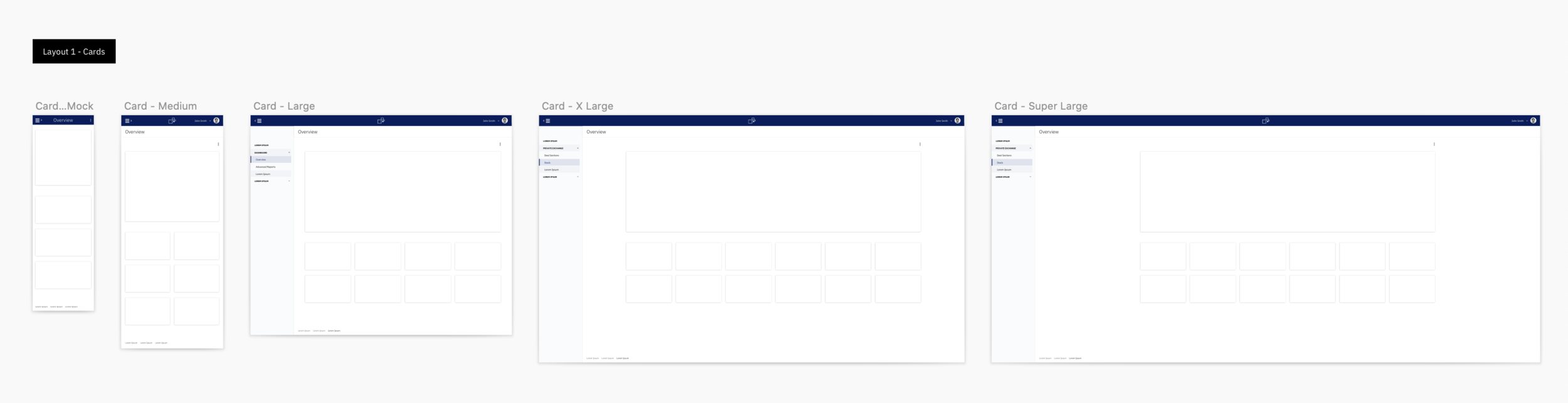
Layouts
We made a shortlist of the main layouts we were expecting in our application. I started by creating paper prototypes to represent each layout.


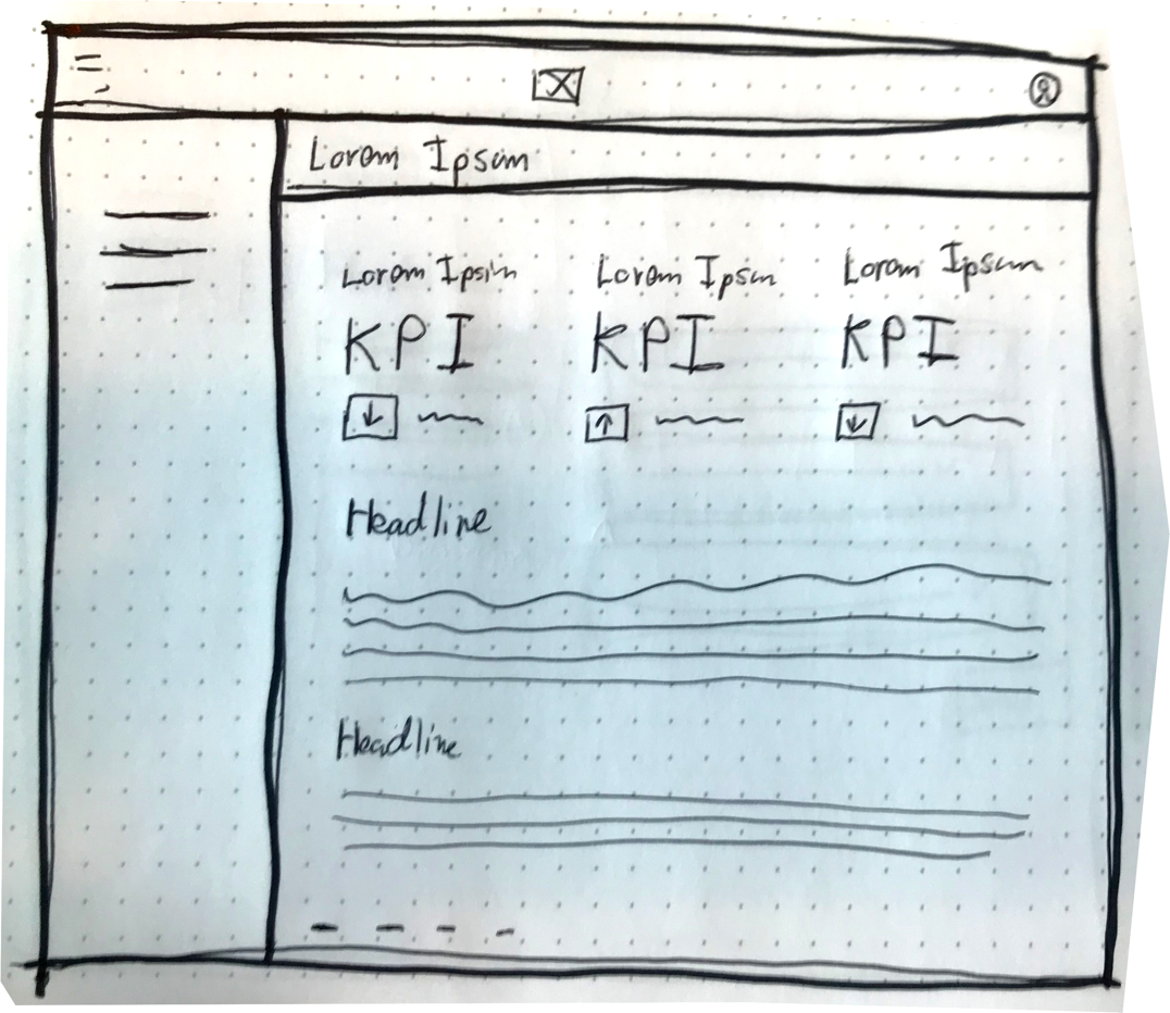


Even though mobile-first responsive behaviour is not a priority for Index Exchange we wanted to ensure each layout was designed to accommodate mobile responsiveness. Testing these layouts in production environments yielded significant insights as part of our ongoing support and maintenance for the design system.
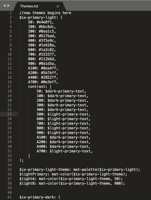
Colour
One deceptively difficult area was colour. We began by tweaking and adapting our brand colours to be more friendly to a digital web application. Next, we generated styles based on material colour tool guidelines to pass accessibility and follow material guidelines.
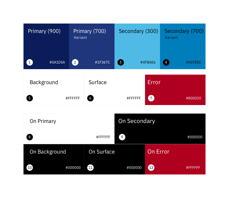
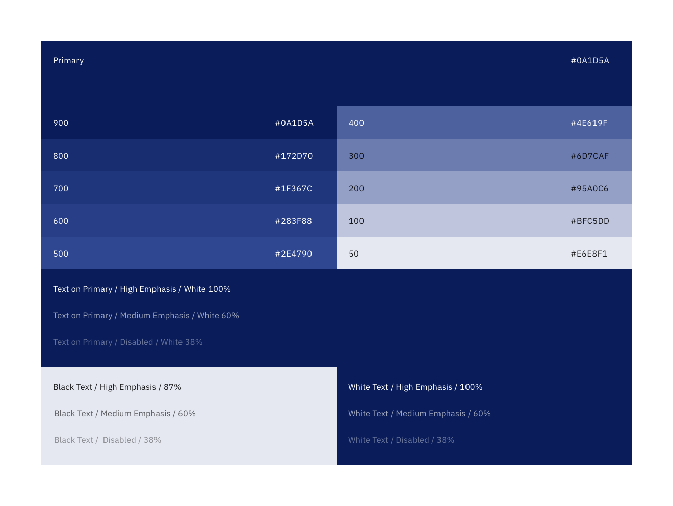
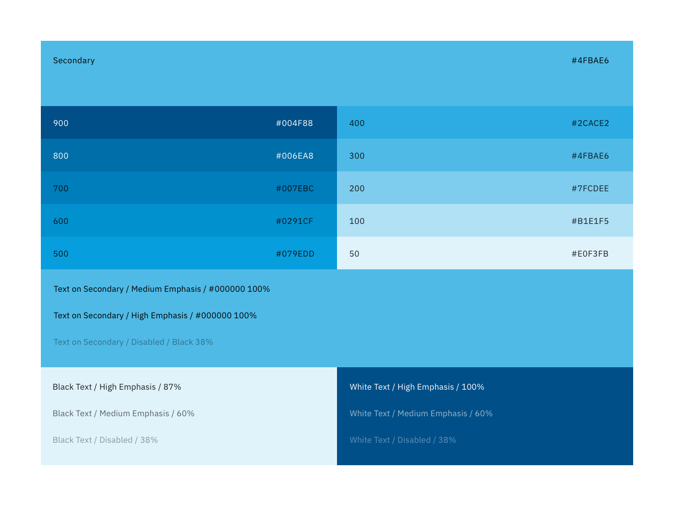
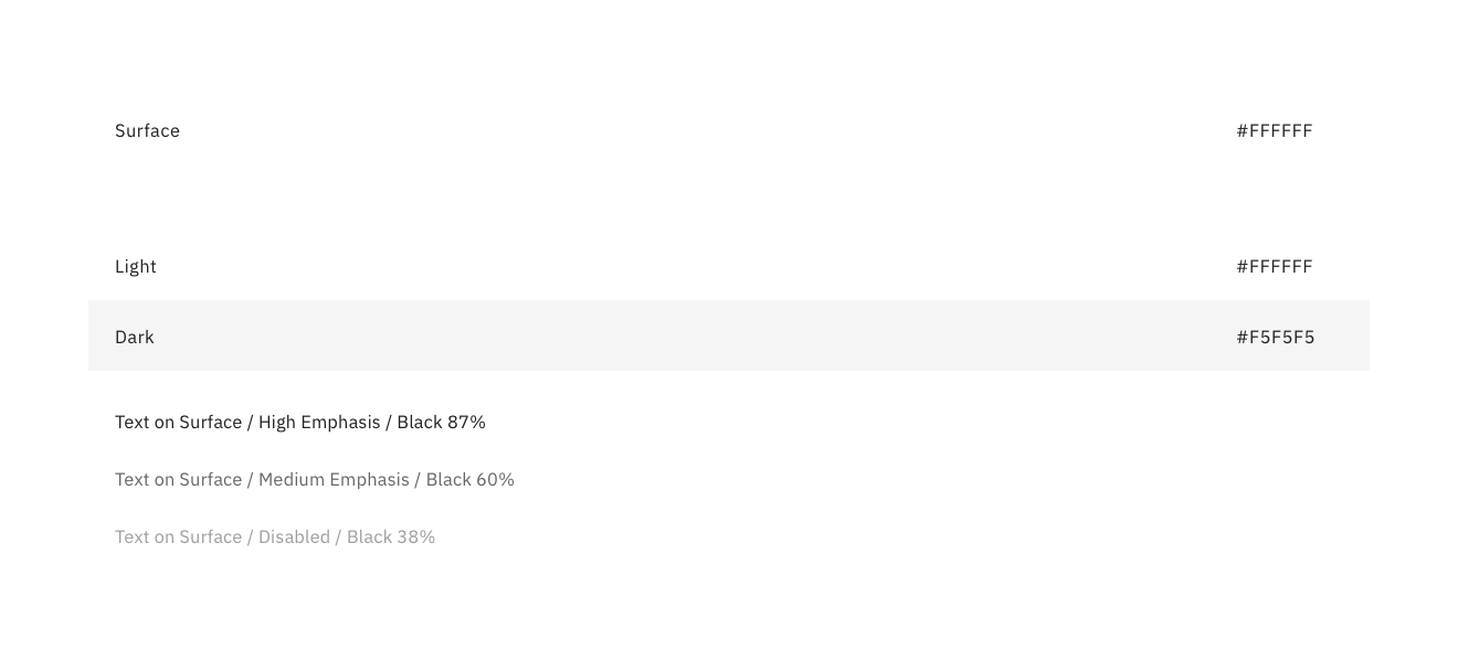
Finally, I created a presentation to educate my team and other stakeholders on how Material Design uses and scales colour. This would directly impact the way we would scale colour across our designs and how the theme file would scale colour across our application.
Typography
Index Exchange's brand font, Adelle Sans, was poorly suited to the needs of a digital web application. We decided to use this opportunity to identify a typeface that was well suited for the needs of a digital web application. This meant not only looking good but also offering a variety of weights and supporting the 8 different languages our application was currently translated into. We settled on IBM Plex as our official font and defined the first version of our type system using it.
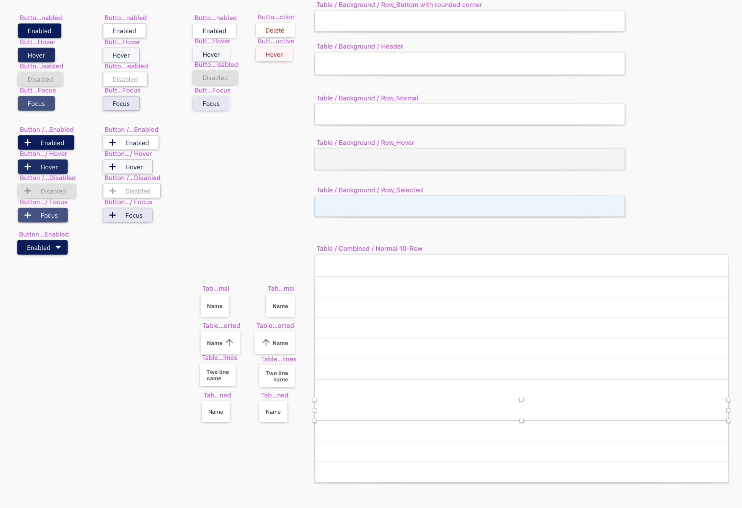
Components
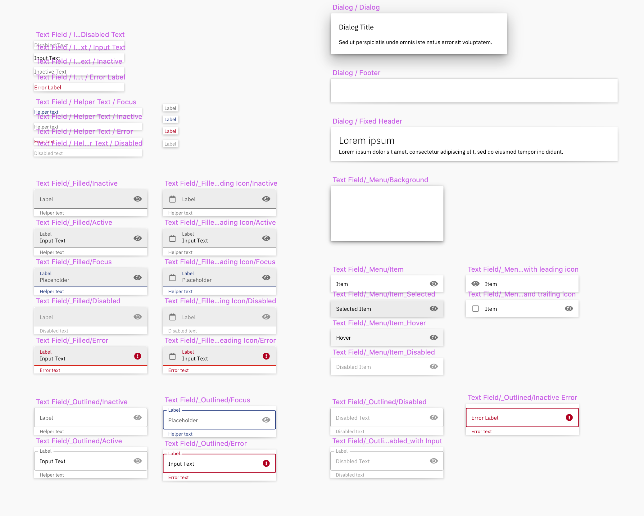
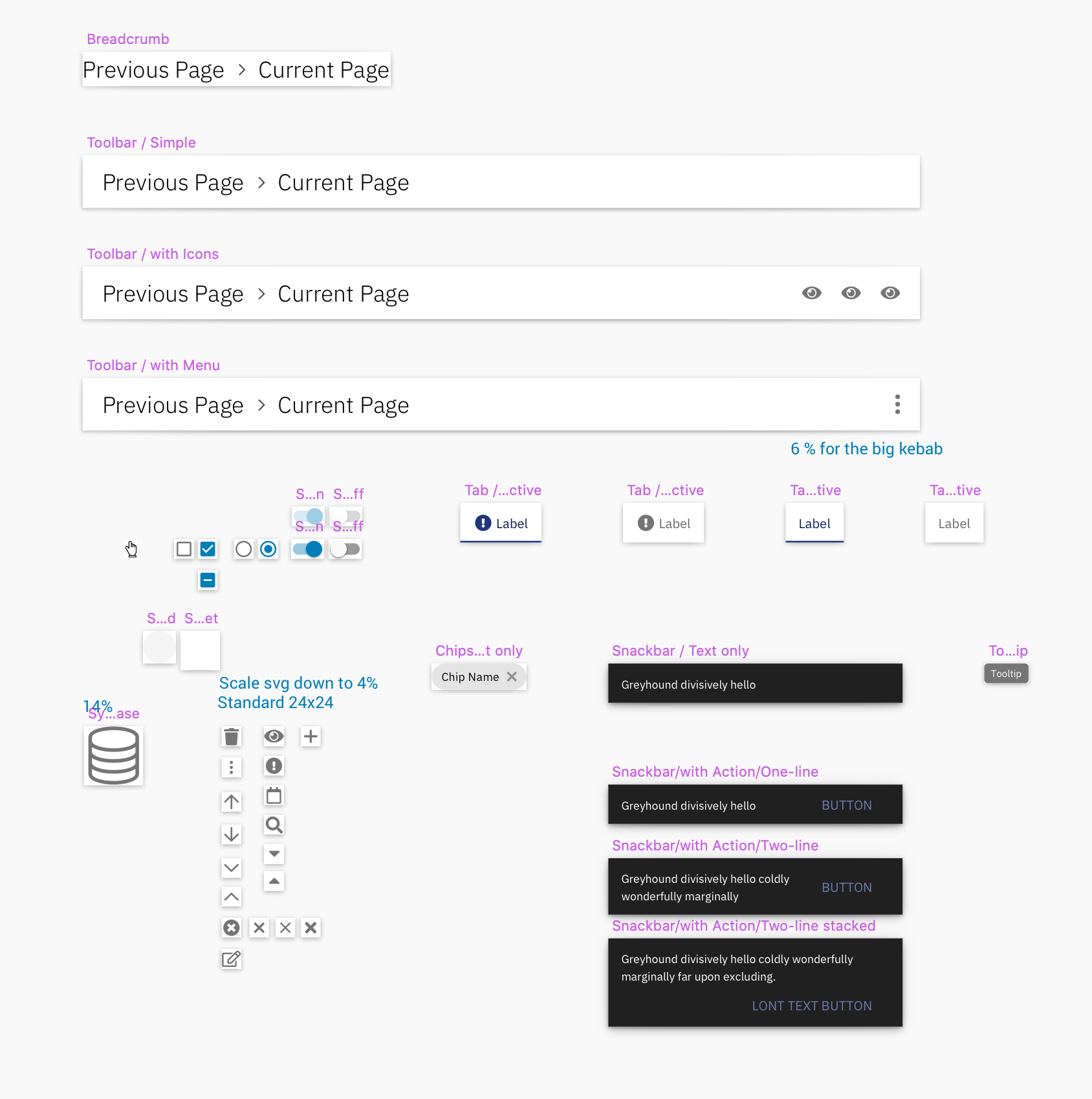
We identified four components as the primary UI elements necessary to replicate 80% of the functionality currently available to users in our old Bootstrap application. They were as follows:
- Buttons
- Text Fields
- Selection Controls
- Menus
We leveraged the Material Design Guidelines provided by Google for the foundation of our components. Additionally, we applied our own custom styling to reflect the Index Exchange identity leveraging our foundational colour palette.


Modules
Navigation
This is how users move through Index Exchange's old Bootstrap application today.
We studied industry standards and what the best in the business are doing including many of our direct competitors. We came up with several different ideas for our new navigation system. We tested the variations we felt strongest about and iterated on the designs and then we tested some more.
Finally, this is what we landed on. Up to 5 layers of navigation to support the most complex navigation requirements


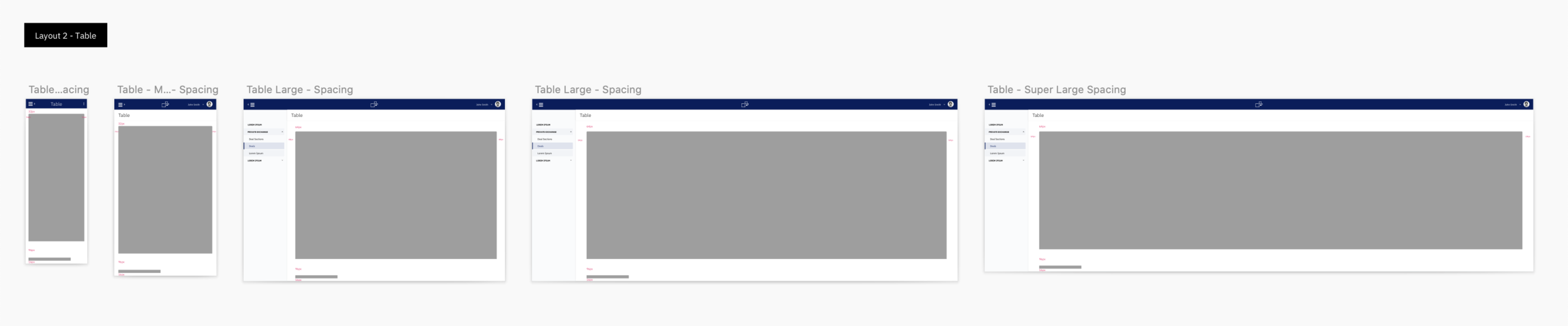
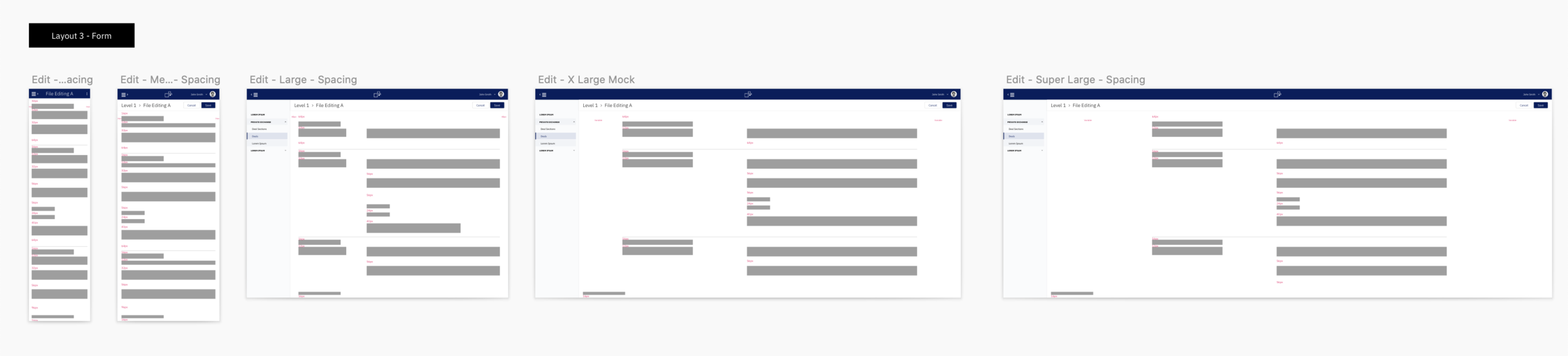
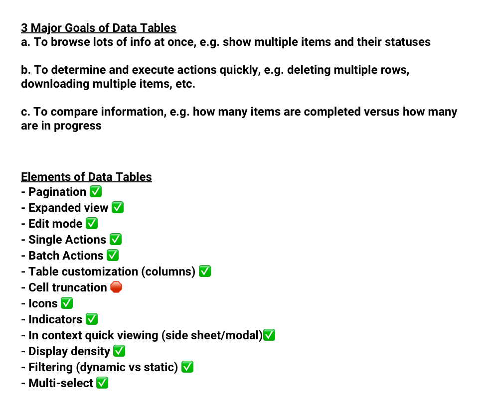
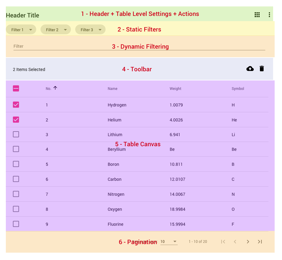
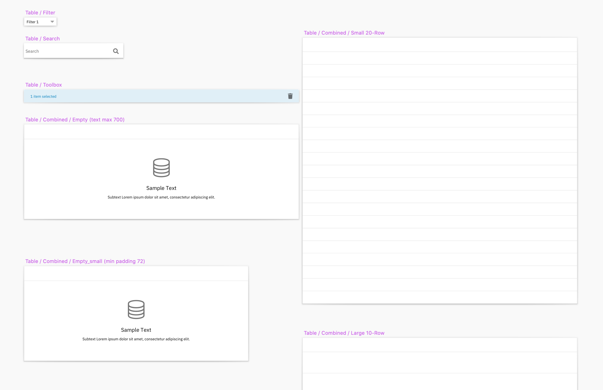
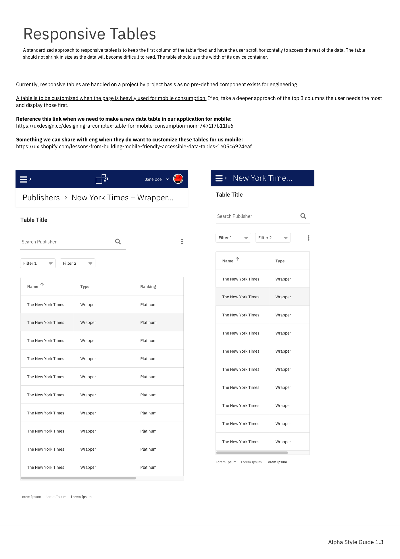
Tables
Our existing tables are useful but inconsistent and hard to use. We wanted our new tables to be consistent and robust.
I settled on the following list of features in order to fulfill the requirements we defined for our new tables. The first iteration resulted in a design that had five clear levels of hierarchy in order to support the most complex features and use cases. We would later continue to iterate and streamline the design of our new tables to the current version we utilize today in our system.
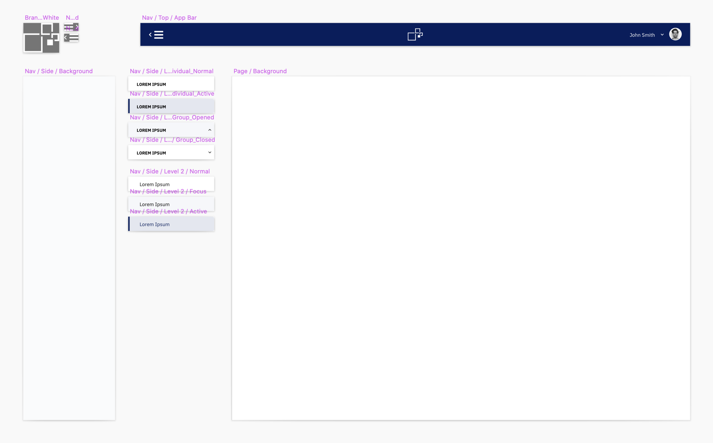
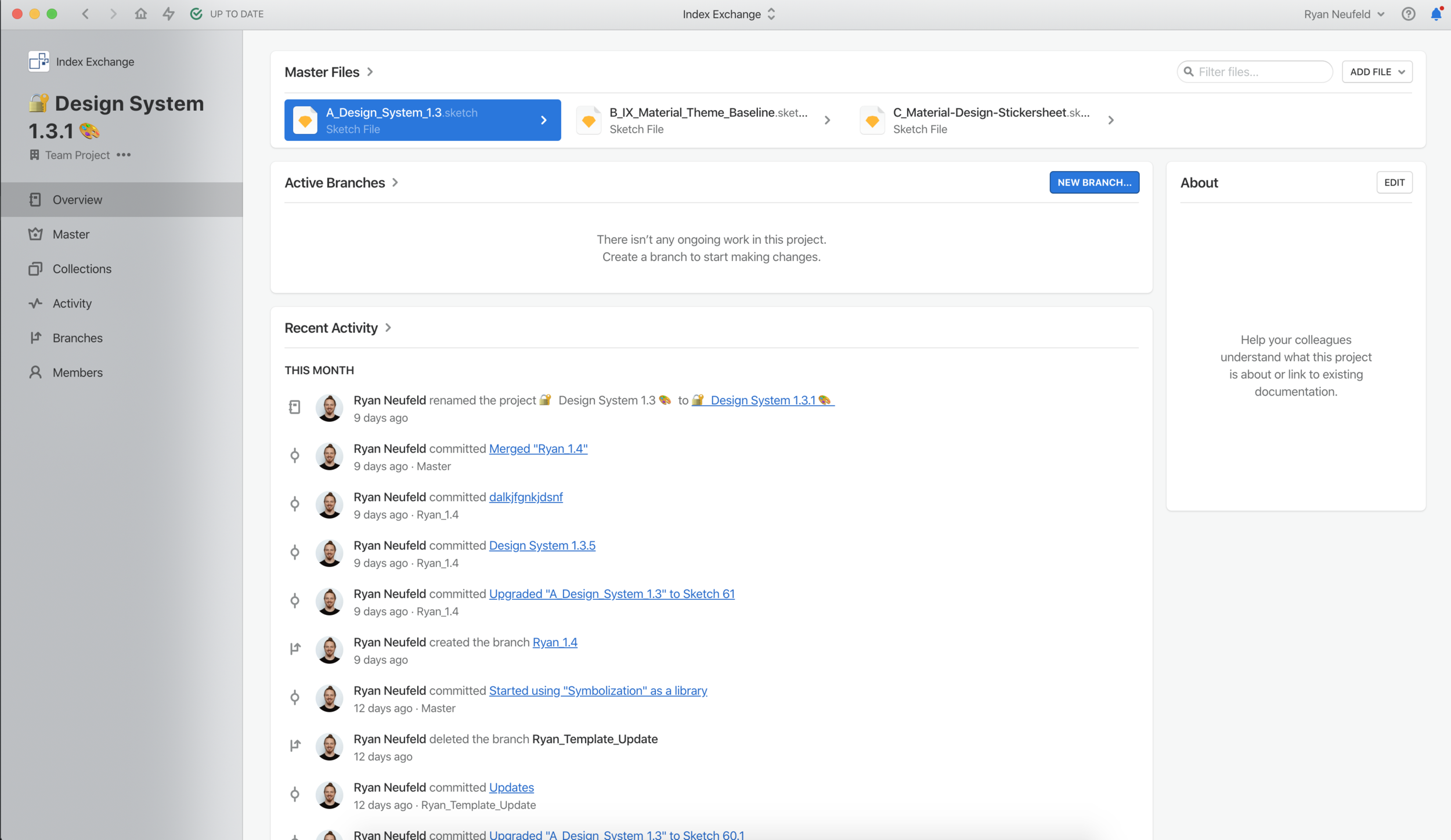
Shareable Sketch Library
We used the Material Design UI kit and the Material Design Guidelines provided by Google for the foundation of our library components in Sketch. We stripped away some of the complexity Google built into their kit and applied our own styling and naming convention to meet the needs of our library.
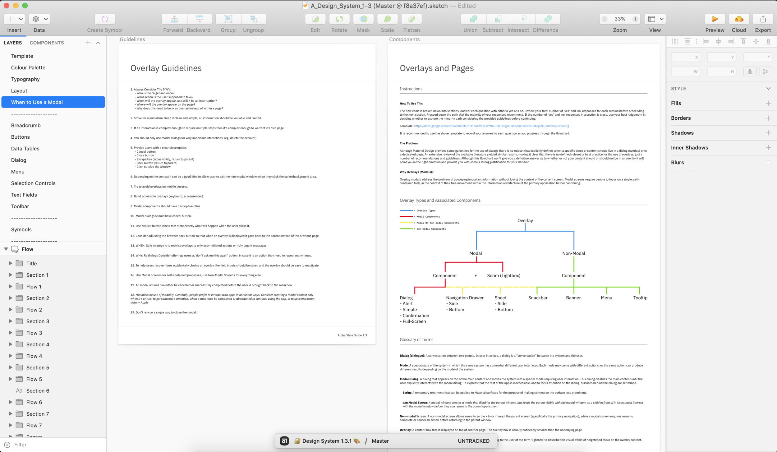
Guidelines and Documentation
Once we moved out of the proof of concept phase and into production use we slowly began to identify gaps in Material Design’s guidelines that did not account for common use cases we were encountering in the context of Index Exchange’s, desktop-focused, enterprise web context. So, we began the process of modifying and documenting our own guidelines, as well as defining design patterns specifically for our needs.
Theme File
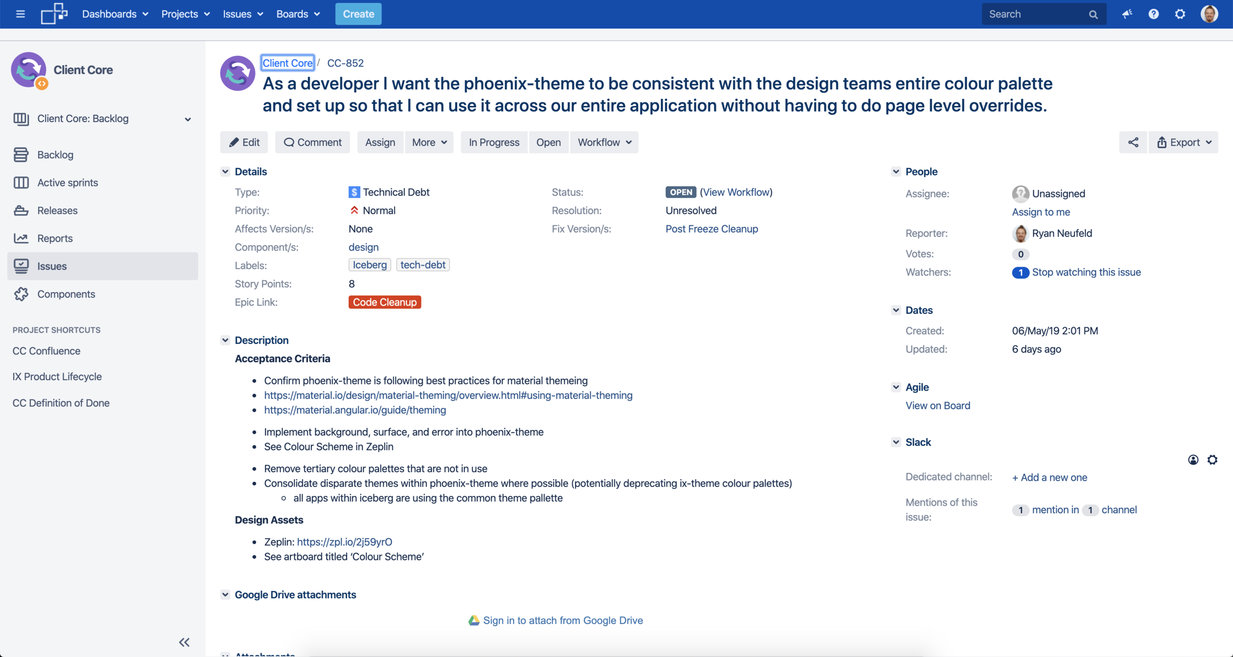
Engineering slowly began the development of the theme file that reflects many of the foundational styles we defined. The file in use by our developers today exists in a state that does not reflect the current reality of our design standards. However, there is a user story I have written waiting in the backlog for our Client Core Product Development Unit (PDU) to refactor and update the file to match our current design standards.
The Current Version
Below are some examples from our design system. For a deep dive into our guidelines and symbols feel free to explore the following resources for yourself:


The Impact
More Consistent, Effecient, and High-Quality Designs
The on-going development of the Index Exchange design system has directly impacted the direction of the new Index Exchange web application resulting in:
- A new Angular web application equipped to serve the needs of users in a modern web environment.
- A single source of truth, including documented design patterns, and guidelines for their use and implementation.
- A Sketch library used to efficiently produce consistent high-fidelity designs.
- A ‘guild’ comprised of engineers and designers passionate about front-end development dedicated to maintaining design and code standards.
- A more collaborative approach to the design and development of Index Exchange products.
- A reimagining of the Index Exchange identity optimized for modern digital applications.
- Product Designers spending more time and energy on user experience and interaction design rather than reinventing visual and UI design over and over again.
Challenges
There were many challenges on the design team as well as extensive organizational challenges in the design, development, and implementation of the design system.
Design Challenges
- Tracking and scheduling design tasks.
- Defining a unique and independent personality for our system.
- Defining a naming convention for our components.
- Solving system-level design pattern gaps that emerged during testing of the system.
- Teamwork and collaboration with external stakeholders.
- Scaling the system across our internal design tooling.
- Maintaining guidelines and libraries for components and patterns.
Organizational Challenges
- Getting external stakeholders like engineering and product to commit resourcing to the design system independent of our team.
- Prioritizing design system work across multiple Product Delivery Units (PDUs).
- Implementing and integrating new technologies and components from scratch (like our dual list box component).
- Shifting organizational perspectives on the Design System from a project to a product.
- On-going maintenance and organizational adherence to both the execution strategy and transition strategy.
- Ongoing maintenance, updates, and support of the front-end codebase and supporting assets (theme file, component library, JS framework, etc).
- Support for prioritizing design updates to styles and components.
- Organizing and coordinating the Guild, its membership, meetings, and content.
What I Learned
Building a Design System is Easier Said Than Done.
Design systems solve two major problems for designers: scalability and consistency. Getting your organizational partners to buy-in to treating your design system like a product is even harder and won’t always be possible. Even though a collaborative approach to building a design system is the preferred strategy for execution there are alternatives. When our product and engineering partners refused to officially resource our Design System proposal I didn’t give up. Instead, I prioritized the items within the control of my team and we developed a system that we would use to consistently produce designs. Then, as the company began to build products and features based on their new front-end infrastructure and encounter many of the same historical problems we could present them with a system-level solution that we were already producing designs from.
If there’s one thing companies hate more than investing money in design it’s burning a wheel barrel full of money as engineers continually struggle to implement simple front-end code over and over again. If you find yourself in the same situation then your company might be a good candidate for a system-level solution like a design system.
Made in 🇺🇸 with ☕️🥃❤️