One Big Thing

To Do Lists, Design Tokens, and InVision DSM
Designers and developers waste a lot of time trying to keep code in sync with design. InVision Design System Manager (DSM) attempts to solve this problem by putting the power of Design Tokens in the hands of designers and developers. Design Tokens act as variables that store your visual design attributes so that your colour, text, and other style attributes will always be up to date.
To put DSM’s Design Tokens to the test, we designed and built two prototypes of our favourite to-do list framework, One Big Thing; the first using ANT design, and the second built from scratch. Try them out for yourself and check out our step-by-step guide, it was one of the top 10 articles on InVision's Inside Design Blog in 2019.

My Role
For this project I was the lead designer and primary stakeholder. I came up with the idea for the project and was responsible for all designs, from low to high fidelity, design tokens, project management, implementation, and finally QA of the final product. I worked closely with Martin Laws as my UX developer on the project. When we’re not working on side projects together he spends his time as a consultant, teacher, and stand-up comedian. Currently he’s running his own consultancy called Lowtide Consulting and lives the dream with his dog Maya.
The Problem
DSM is a product that promised to solve a lot of problems for designers and developers. Design Tokens were the biggest selling feature for me so we decided to build an application to answer one simple question: “does this feature actually work?”. Together we set out to build a proof of concept that I would design, and my collaborator would build. I’m going to show you how we did it.
Setting The Stage
Design Systems
Let’s start with the basics. A design system is a collection of reusable components, guided by clear standards that can be assembled together to build any number of applications. Companies usually build Design Systems to ensure consistency, quality, and efficiency in order to reduce costs and make for a more consistent experience.
The benefits of Design Systems break down into 3 main categories:
- Speed
- Scale
- Innovation
Agile, cross-functional teams benefit because it allows the team to collaborate using a common language and bring everyone closer to the user.
In addition to the general benefits of design systems for designers they offer specific benefits for our developer friends, such as:
- Reducing repetitive re-work from their workload.
- Allowing time and energy to be invested into creating high-quality code upfront.
- Addressing UX and UI technical debt.
- Developing components that are easier to maintain, lighter weight, and that improve the speed of a product by having standardized pieces of code.
Design Tokens
Design Tokens are the visual design atoms of the design system — specifically, they are named entities that store visual design attributes. They are used in place of hard-coded values, such as hex values for colour or pixel values for spacing, in order to maintain a scalable and consistent visual system for development. Design Tokens have the potential to bridge the gap between design and development, allowing a change to a UI element by a designer to be pulled by a developer so they can update the code associated with that element, ultimately reflecting the designer’s change.

Design Tokens are versatile and can be used for any number of things including:
- Colour Palettes (DSM supported)
- Font Families (DSM supported)
- Icons (DSM supported)
- Borders
- Breakpoints
- Z-index
- Sizes
- Spacing
Design System Manager (DSM)
InVision Design System Manager (DSM) offers four major features:
- Sketch plugin via InVision Craft
- Web View
- Design token API
- Cloud storage and versioning
In addition to this, InVision DSM gives teams:
- Access to a single source of truth
- The ability to iterate with confidence and collaborate
- Design at scale
The Concept: One Big Thing aka ‘1-3-5’
I decided to test DSM by developing a proof of concept to-do list application. This wouldn’t be just any to-do list application though; instead we chose to build a web application we would both actually use in our day-to-day life leveraging a method known as ‘ one big thing ’ (aka ‘1-3-5’). In this to-do methodology a piece of paper is divided into three sections. The first section should contain your largest and most important to-do item, or your ‘big thing’. The second section is further divided into three boxes which contain your three medium things. Finally, the last section is for your small things (5 is recommended but I often do more).
Discovery
Preliminary Research
We started by sitting down and doing some very rough sketches in my notebook to discuss how the application would function and the types of interaction elements we might use in the product. After coming to an agreement on the rough direction for the design we proceeded to list out what we thought the other major steps in validating the tech stack would be. They broke down as follows:
- Investigate and validate DSM design tokens feature + API
- Investigate and validate whether DSM’s design token format would be compatible with a pre-existing component library
- Determine whether to build the application from scratch or to use a pre-existing component library (ANT design)
- Determine which front-end javascript framework to use for development
- Identify design and development resources available for ANT design
- Iterate on low fidelity design
- Iterate on high-fidelity design
- Setup style sheets in Sketch and DSM application design
Tooling
During our initial ideation session we discussed features we wanted to offer users, how we expected them to function, and what UI elements would be appropriate, but would also demonstrate some variety in the capabilities of design tokens.
Before going any further we had 3 technical questions we needed to answer:
- What front-end javascript framework would we use?
- Does the DSM tech stack actually work?
- Should we try to add a component library into the mix?
Front-end Framework
This was pretty straightforward. As a designer I had a slight interest in Angular but only because that’s the framework my company built their application on and if this worked I could then leverage this work on the job. Martin on the other hand wanted to use Vue.JS and since he was the one doing the development work that’s what we went with.
Designer Tech Stack
We needed to validate that DSM and the user flow between Sketch, InVision’s Craft plugin, and the DSM API actually worked as promised. If I could complete this validation then Martin would be able to test the DSM API with a sample production environment. I’m not sure we actually expected it to work, but it did!
Component Library
At this point we engaged in a new conversation about whether or not we wanted to try and include a pre-existing component library in the tech stack (Sketch>Craft>DSM>JS framework>Component Library>Production App). Again, I had a slight bias towards this solution because this is a problem I was trying to solve for my design team at work. Martin agreed with the idea and after some research and discussion we both landed on ANT Design’s Vue.JS component library to act as our library for development and UI kit for design.
DSM Resources
There was a learning curve for both of us (but mostly me) when it came to using DSM. The major lessons for me were as follows:
- The Sample Library
- If you have an InVision account then you have access to DSM. It comes with a sample library by default that you can browse through both on the web and in Craft. This is your best friend when it comes to learning the ins and outs of DSM.
- DSM’s Design Tokens
- Design tokens can do a lot of things, but right now DSM only supports colours, text styles, and icons. They’re looking to add spacing, border radius, z-index/elevation, and shadows in the future.
- DSM API
- This resource is the only documentation out there for DSM’s API. It’s important to know that you can use your design tokens without it, but this just adds a little automation to the process.
The Design Process
After addressing our 3 major technical considerations and digging up some resources for DSM it was time to get to work. We tracked the remainder of the steps that would be required for us to complete the project using Notion.so . In Notion we broke these tasks out using the labels ‘Design’ and ‘Front-end’. Using these tasks to guide my design process looked something like this:
Paper Prototypes
V1 - Coffee Shop Dreams
My design process started where all of my projects start, on paper. The sketch Martin and I made in a coffee shop during our first meeting about the project gave us enough context to scope out the types of components we would use as well as expected behaviour. This paper sketch constituted the first iteration of our design and looked something like this:
V2 - Exploring UI Elements
Admittedly V1 was a bit bare bones but it served the purpose of validating the general layout and workflow users would follow. So, like any good designer I eventually sat down with a pen and some paper to work the problem some more. For this iteration my focus was on the UI elements in the design. Since this was a technical proof of concept I wanted to use a lot of different UI elements such as buttons, icons, radio buttons, and checkboxes to demonstrate the range of design token capabilities. Additionally, I began to explore two additional features we missed initially: clearing the interface of the cached items, and the ability to flip between a light and a dark theme to demonstrate the use of two different sets of design tokens.
V3 - ANT Design Inspo
Somewhere between V2 and V3 Martin and I began to look more closely at ANT’s components. At the same time I had begun to gather some feedback from Martin about the development implications of UI elements I was exploring. This lead me down a more simple path of inputs and checkboxes as the primary components in the application. I also began to think more seriously about the nav bar of the application and what direction to go with the nav bar actions.
V4 - Having Fun
At this point I remembered I wasn’t at work and no longer had the constraints of an enterprise software company so it was time to have some fun. The functional direction felt pretty solid at this point so I began exploring the use of cards and how to break them up to make them a little bit more interesting. A lot of this didn’t make the cut but it served to inspire the direction of our simpler custom design.
Ant Design
Naturally, I started out on ant.design to learn as much as I could about the design system. I used the provided Sketch UI Kit to start scoping out how I would implement their components in my design. In the process I started tweaking a few components to play more nicely with English instead of their default Chinese characters. Once I had a handle on ANT, Martin and I connected to update each other on our progress, which is when I learned about the intricacies of trying to integrate VUE ANT with DSM. This required I learn to navigate the Less files on github, and mapping out all the names of the colour variables for each component I wanted to use so I could match their names in the DSM design tokens. Talk about a pain in the ass.
V1 - Barebones ANT
At long last, it was time to turn my sweet, sweet sketches into reality. I started by defining the responsive web layout I would be using for the application. I combined this with the components I had prepared from the UI kit, and a rudimentary card design to produce my first iteration using the default ANT design styles.
V2 - Cards
In order to evolve the design to be more in line with the vision laid out in my paper prototypes I had to design out our cards, which turned out to be a more difficult UI design task than I had anticipated. I went through a number of card iterations before landing on one that maintained the spirit of the design while functioning well within the constraints of ANT’s components. Some minor adjustments were made to the spacing and layout of the cards on the canvas of the page to accommodate an 8-point grid system.
V3 - Refining the Navbar
After receiving some feedback from my colleagues at work, very minor changes were made to the canvas of the application. The primary focus of this iteration was on the navbar in order to refine the layout, functionality, and components in use.
V4 - Colour, Typography, and Finishing Touches
For my fourth and final iteration I brought my focus back to the purpose of this project: demonstrating the value of accessible and usable design tokens for style variables like colour and typography. I spent a lot of time coming up with a colour palette that I felt was unique and different enough from the default ANT styles to demonstrate the versatility and scalability of a colour system leveraging design tokens. Additionally, I defined a new type system to further differentiate the product from ANT’s default styles. Last, but not least, I spent some time polishing the visual design, adding a logo, and streamlining some of the UI elements into simpler, more scalable options across viewports.
Pivot: Custom Design
Around the time we hit V3 of our ANT prototype we realized that integrating a component library with DSM’s design tokens was a pain in the ass and for the sake of demonstrating our work it would likely be a lot more difficult for the average designer to understand. So after some discussion we decided we would produce not one prototype to-do list but two! The first leveraging ANT, VUE, and DSM and the second a completely custom front-end experience built by Martin leveraging VUE and DSM.
V1 - Same same but different
I wasn’t expecting to have to produce another design of the same application but I looked at this as an opportunity to get a little bit more creative than the more standard application experience ANT provided. The first question I asked myself was how could I visually distinguish this custom version from the ANT version we had already invested so much energy into. The immediate opportunity that presented itself was the cards since these served as the visual foundation for most of the application. I went back to my card explorations I had done for ANT V2 and began to iterate on the visual design. I explored how I could use shape, colour, and emojis to convey much of the same functionality as ANT’s components. This resulted in a barebones design intended to make development easy and the product fun.
V2 - All the small (functional) things
Martin provided some feedback on the ‘Small Things’ card indicating that given the purpose of the custom design as a secondary demo, the development effort required would be better spent on the ANT prototype. So I set out to come up with an easy solution for the Small Things cards. This ended up being a static container with links to all of the content and resources related to this project.
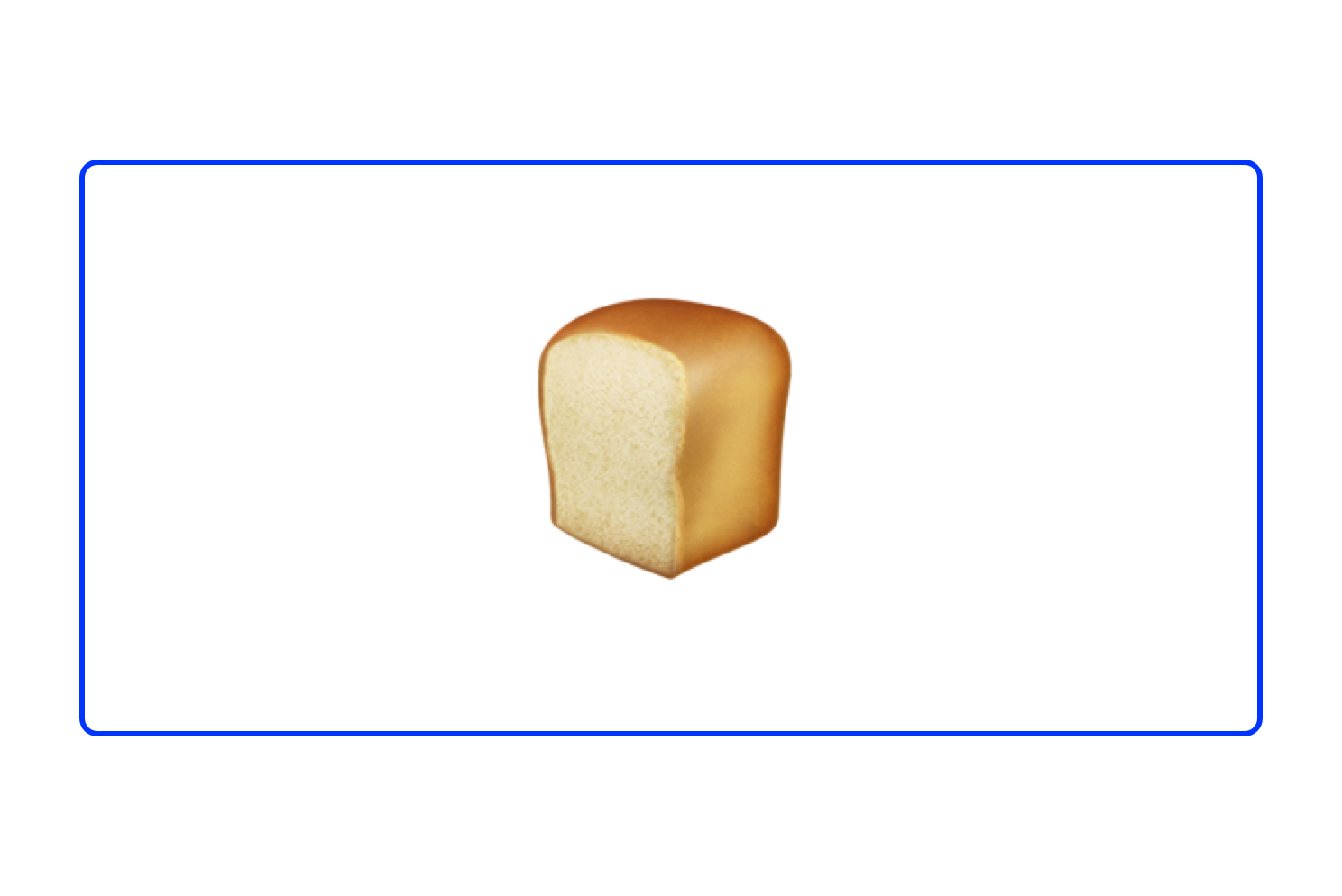
V3 - Let’s get that bread
For the third iteration I applied some of the same design insights from ANT V4 to the nav bar. Inspired by one of my favourite memes I decided to get a bit more creative with the use of emojis on the default state of the to-do list. Finally, I formalized the colour and type styles in order to execute on the primary purpose of this new prototype, demonstrating the versatility of DSM’s design tokens.
V4 - Dark Mode, so hot right now
As part of our experiment I designed a dark mode for the application to demonstrate the power of design tokens by drastically updating the colours of our live production application. Check it out live below. If you’re interested in learning how to do this for yourself check out our step-by-step guide .
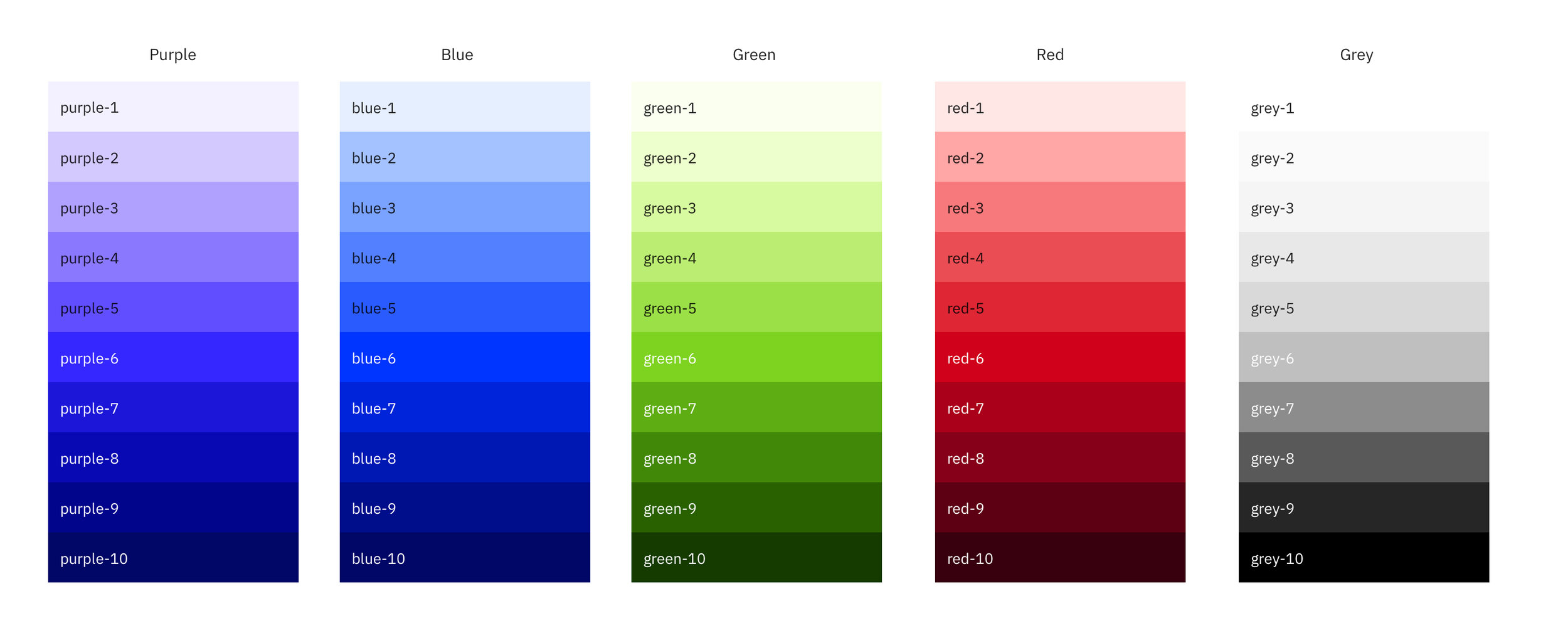
Colour Palettes
Colour is hard. I don’t have much formal training on the topic so for this project I created my palettes using a mixture of personal preference, and colour systems that could do the hard work for me and scale my choices into a system. I explored colours using tools like coolors.co , color.adobe.com , and good old fashioned dribbble . Once I had primary and secondary colours I liked I ran them through Google’s Material Theme Editor Sketch plug-in to generate a system level example and their associated palettes. I created 5 palettes I felt ok about, but ended up going with the earthy tones you see in the final ANT product contrasted by the vibrants colours in the custom prototype.
The Prototype
You didn’t think I would skip the most important part did you? The final step in the process was to setup the DSM libraries for the prototypes. Each library would represent the colour and font style variables for our ANT, and custom prototype. The process was slightly different between the two prototypes due the technical constraints of the tech stack for the ANT prototype. I will outline the process for each below.
ANT Design and DSM, Matchy Matchy
In order for the DSM Design Tokens to work out of the box with the Vue.JS ANT component library the name of each design token needed to match the name of the existing colour variables in the code for each component. This meant making a list of every ANT component I was using in the design and then going into the styles.less file for ANT’s Vue.JS Github page and writing down each style variable and then mapping it back to how it appeared in the actual component. On paper this isn’t that difficult, but in reality I found the structure of ANTs style variables to be non-intuitive at best and confusing (at least as a designer) at worst. After mapping out all of the ANT components and their associated style variables I was using in my design I created a map of these variables names by component in Sketch so that I could more easily create and properly name the required design tokens. Once this was done I proceeded to create the tokens themselves in DSM using InVision Craft plug-in, which acts as the interface between Sketch and DSM for designers.
Note: Font tokens had been scoped out for the ANT prototype due to an incompatibility between ANTs variable structure and DSM’s token naming conventions.
Our Custom Design and DSM
The process for the custom prototype was much more straightforward. For my colour styles I created design tokens straight from the palette I had laid out in Sketch with appropriate labels representing the range of the colour palette from 0-9. For my font styles I followed a similar process of using the style sheet as I had it laid out in Sketch, and using logical labels to represent the range.
InVision Craft… Not so Crafty
As mentioned earlier, Craft, InVision’s plug-in for Sketch, acts as the primary interface between Sketch and your DSM library as it exists to anyone outside of your design team. I don’t think any designer who uses Craft for its other features loves it to begin with, but DSM is particularly frustrating to use within the context of Craft and was probably the most challenging part of the whole project.
Conclusion
Design tokens work, they’re damn cool, and they solve a problem. Using DSM’s design tokens with a pre-existing component library is cool but a lot of work if you’re trying to be efficient so this probably isn’t the best use case for the way DSM generates their tokens. At the end of the day, DSM successfully solved the problem we were trying to address across both of our prototypes.
Conceptually, DSM is a product that fills a much needed gap, particularly for small, less mature companies and teams. Practically, DSM delivers what it promises but the experience is still clunky and limited enough that I wouldn’t want to use it to manage my entire design system. That said, I would consider using DSM to manage styles with future collaborators and projects.
Design system will always be a pain in the ass to manage. I have no doubt that one day soon a product will appear that solves this problem and does it well, whether it’s a new version of DSM or something else. Regardless of whether or not you’re using design systems in your current design process, design tokens are awesome and I would encourage you to try them out on one of your future projects.
Resources
- Simple Prototype - https://dsm-todos.netlify.com/
- ANT Prototype - https://dsm-todos-ant.netlify.com/
- Simple DSM - https://projects.invisionapp.com/dsm/low-tide/low-tide
- ANT DSM - https://projects.invisionapp.com/dsm/low-tide/milk-dud
- Notion Project Management - Notion.so
- ANT Design - https://ant.design/
- ANT UI Kit(s) - https://ant.design/docs/spec/download
- ANT Vue.JS - https://github.com/vueComponent/ant-design-vue/
- DSM Web Documentary - https://www.invisionapp.com/design-system-manager/expert-advice/
Made in 🇺🇸 with ☕️🥃❤️